
What is UX?
The term user experience, or UX, is still relatively new in higher ed marketing, but it is fundamental to the work marketers do every day.
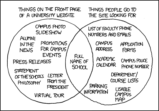
Put simply, user experience is about becoming the advocate for the end user of our website and other digital systems. It’s making sure that we’re delivering what prospective students, current students, alumni, staff, faculty and donors actually want from our website and not making them work too hard for it. Basically, it is being the living embodiment of that XKCD cartoon.
Is there a life after the higher ed web homepage?
Most institutions, and the web design firms they hire, do put a lot of thought into user experience on the homepage and top levels of their sites, especially during redesign projects.
But university websites are sprawling things as Melonie Fullick reminded us last week in “University websites: The so-so, the bad, and the egregious.”
Blessing and curse at the same time, content management systems (CMS) let anybody edit the website. In many campus departments, this task falls to student assistants, administrative support coordinators, and well-meaning faculty. All of them may or may not have a background in marketing, communications, or web design.
The result of this hodge-podge of content creators is a breakdown of user experience three or four clicks after the homepage. Unfortunately for such UX issues but fortunately for the institution, prospective students and their parents don’t stay on the homepage. They do drill into academic department sites, student club sites, and the Financial Aid Office site.
Faculty and staff face similar UX issues when they try to find benefit information on the university’s HR website or other relevant information on another office website.
It can get very messy, very fast, which is why it is critical to create a culture of UX across campus.
Hearing the voice of the user in higher ed
At CSUMB, we benefit from the entire campus using a single content management system, which keeps design and navigation elements consistent.
Our CMS also allowed us to include a universal feedback link on every single page. We ask “Anything wrong with this page?” and provide a short, simple feedback form. When the user submits the form, it sends an email to the last person who edited the page. I also keep an eye on all feedback, and follow up with departments or users if necessary.

We average five to ten responses to this question every week, and almost all are actionable fixes – from typos to broken links to information that is outdated, or information a user expected to find in a certain location and didn’t.

This feedback provides a gentle reminder to our site authors, who often have full time jobs doing something else, to keep up with their sites. But more importantly it brings the voice of the prospective student, or prospective student’s parent, to those site authors, as a reminder of the audience they serve.
Writing guidance
Research has shown that users only read 20 to 28% of a webpage. Even people with high literacy skills prefer simple language because it allows them to skim and understand information quickly.
We nudge our content creators to keep things simple inside the CMS by giving them feedback on the reading level of their content.
Simplifying text until the grade level bar goes green can almost become a game. (We wanted to add Hemingway App to our CMS and give authors more specific feedback, but they didn’t have an API available for us. Yet.) It’s another little way to help content creators keep our web visitors in mind.
-
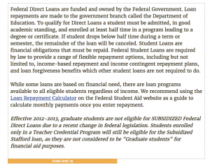
- Grade level 13 in CMS

-
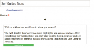
- Grade level 9 in CMS

Ongoing training about writing for the Web in higher education
We hold weekly drop-in training sessions on topics such as writing for the web, useful design patterns, and best practices for accessibility. After a brief presentation, we open the floor for any question regarding web or social media publishing. Often simple questions such as “How do I upload this form?” turn into larger conversations about communication goals, user expectations, and how to measure success.
The open labs help me build relationships with the site authors across campus, and infuse user-centric thinking into everyday publishing scenarios.
Guerilla user testing
One of the most fun aspects of my job is what I call guerilla user testing. I’ll bring my laptop and a bowl of candy and post up in the campus Starbucks. As people are waiting for their drink orders, I’ll ask them do a quick task on the university website. I use the free Silverback software to record what happens on screen, and reward the tester with chocolate.
Here’s a video of a sample user test. The user was asked to find a course that meets the GE requirement for science:
With this method, I’ve gotten useful feedback from students, staff, faculty, prospective students and their parents. I can send video highlights of what went well, or what went wrong, to website authors along with my recommendations for improvement.
Testing in a public space illustrates to passersby that CSUMB cares about their experience and takes their feedback seriously. Which in turn encourages them to use the feedback form, and let us know what we can improve.
Even with these measures in place, our website isn’t perfect. But every day, the content authors and I are reminded of who our work affects and why it matters, and we’re inspired to improve it, bit by bit.
Meet the Author: Liz MacDonald
Liz MacDonald is a User Experience Specialist at California State University, Monterey Bay. Before switching to UX, she was in charge of social media at her school and is a graduate of the Higher Ed Experts’ professional certificate program in Social Media Marketing for Higher Ed.
Tags: Higher Ed Marketing Memos, Higher Ed News