This year again, I asked the 12 higher ed web professionals presenting at the 2019 Higher Ed WEBSITES Conference (HEW19) to share their top 3 favorite higher ed websites.
The resulting list featured 34 names selected via this process (not 36, because Erik could only give me one website :-).
You can find these individual top 3 lists in the the Web Talks Interviews with the HEW19 speakers we’ve been publishing for a few weeks.
Out of those 34 higher ed websites, a site was independently listed by more than one person. This top site was chosen by 2 of the 12 members of this panel composed of web professionals all working in higher education.
You’ll find below the list of these 33 peer-selected favorite higher ed websites (the most popular at the top and the rest listed in alphabetical order) along with the rationale from the higher ed web pro(s) that selected them in the first place.

IUPUI (selected by 2 peers)
Elizabeth Gray – Purdue University
I enjoy IUPUI’s simple and direct pages. They have just enough imagery to remain engaging and relevant (in today’s increasingly visual world) while still remaining simple and to the point. They also use their rich red color sparingly, with bold white text for an easy browsing experience.
Jason Buzzell – University of Nebraska at Omaha
Indiana University System has done well with their design framework spanning to other institutions in the system like IUPUI.

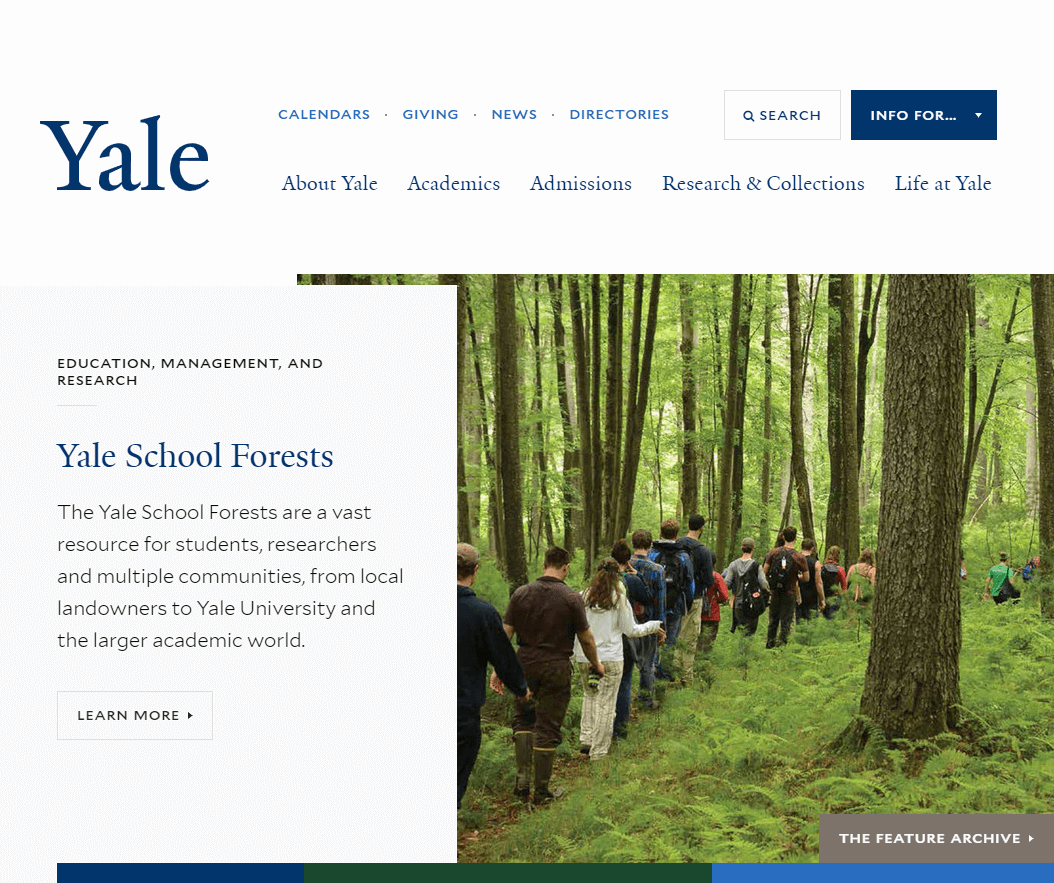
Yale University (2 sites selected)
Ryan Dee – University of Nebraska–Lincoln
When Matthew Carter and Tobias Frere-Jones design your school typefaces, you already have a head start. Yale University‘s solid typographic hierarchy is balanced with an exemplary use of white space. No need to get carried away with flashy gimmicks when you have design executed as well as this.
Elizabeth Gray – Purdue University
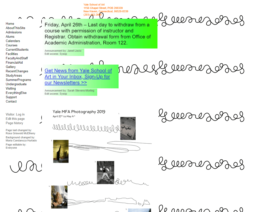
Yale University School of Art is unapologetically not a good website. It’s one of the reasons that this website is my absolute favorite among higher ed. I love that this site shows what the Yale School of Art is. Although not a website I would ever say to look for great development, to me, it is a great reminder that brand and voice can be just as important as form and function.

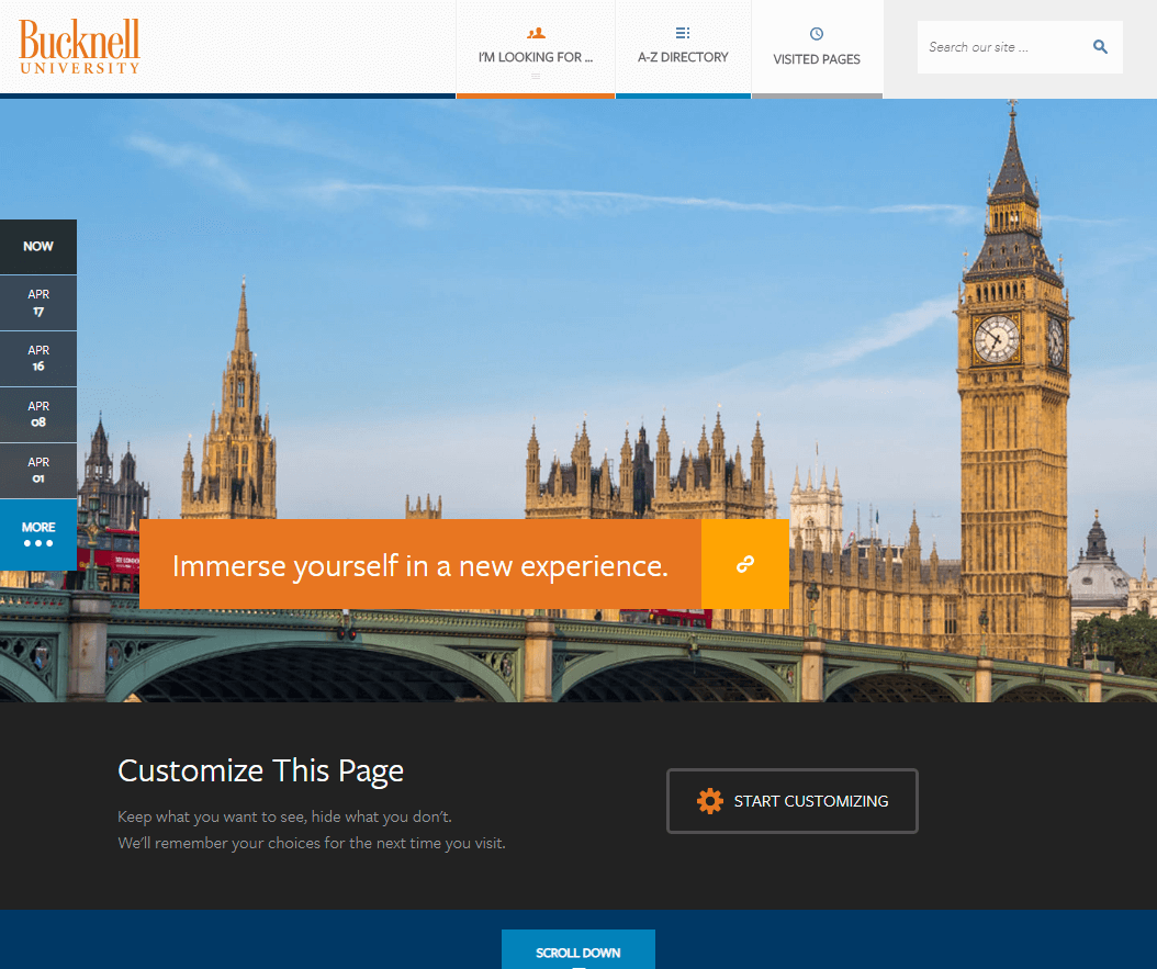
Bucknell University
Aaron Coleman – University of Nebraska–Lincoln
Huge fields of color and great, immersive photography help Bucknell University‘s site stand out. Some cool features like customizable content on the front page and a “visited pages” tab.
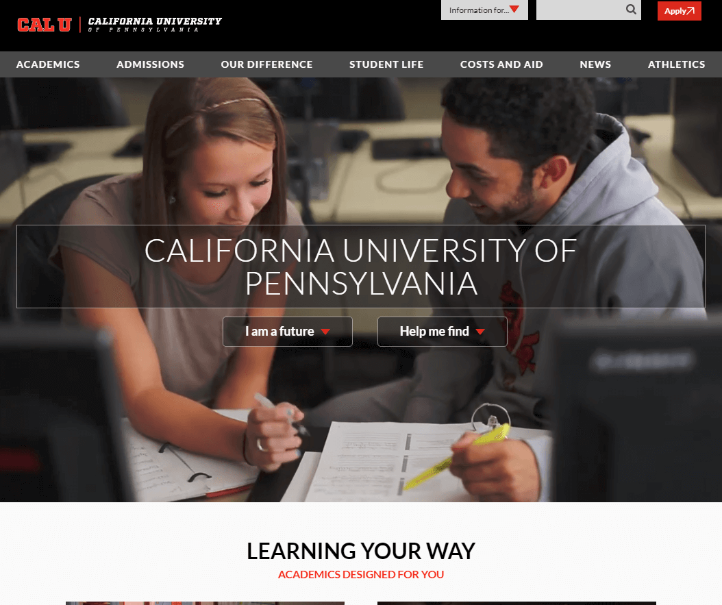
California University of Pennsylvania
Stephanie Geyer – Ruffalo Noel Levitz
California University of Pennsylvania gets how important it is to own the homepage as a sales tool.
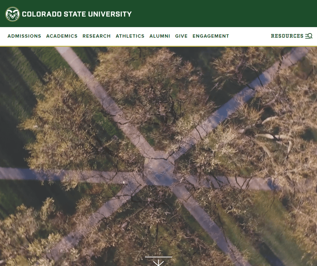
Colorado State University
Courtnie Ridgway – Tarleton State University
There is a lot to love about Colorado State University‘s Website. Both their homepage and admissions site are in my favorites list. Their homepage is crisp and easy to navigate, with plenty of white to balance out the dark green. I love the integration of accent colors to their admissions site. Higher ed websites are usually decked out in the school’s colors. It is nice to see the accents breaking up some of the green and gold. I also love the use of graphics and icons on both pages. We are seeing more and more photo backgrounds and I think this helps to balance some of the design features without compromising usability.
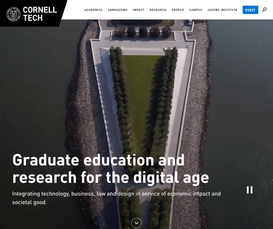
Cornell Tech, Cornell University
Conny Liegl – California Polytechnic State University
Cornell Tech‘s main page offers users a very attractive, seamless design that is easy to navigate despite the wealth of information. I appreciate the well-structured, intuitive main navigation.
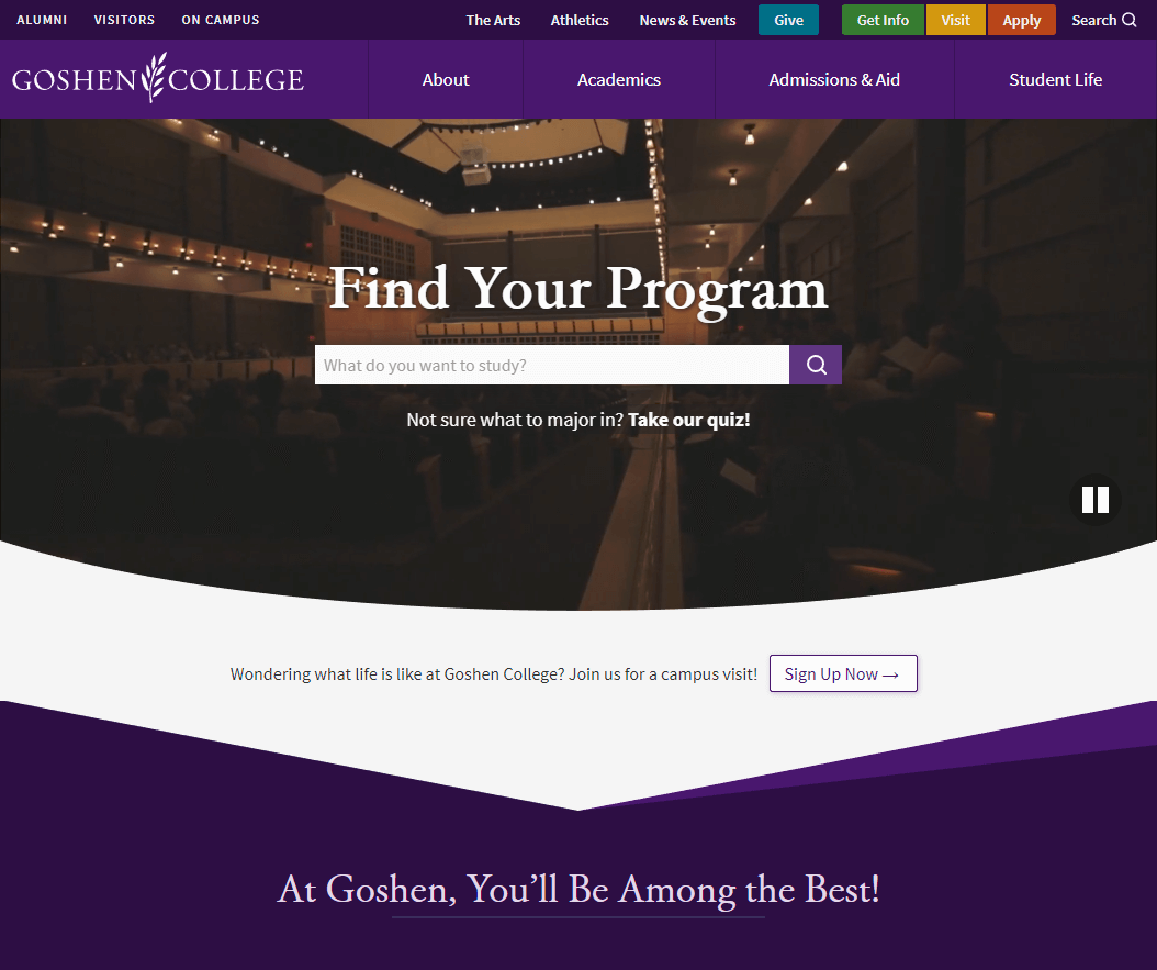
Goshen College
Joshua Charles – Rutgers Business School
Goshen College‘s site does a great job communicating who they are, visualizing the student experience, and remaining simple to use. Their content is also user-focused, informative, and doesn’t overstay its welcome.
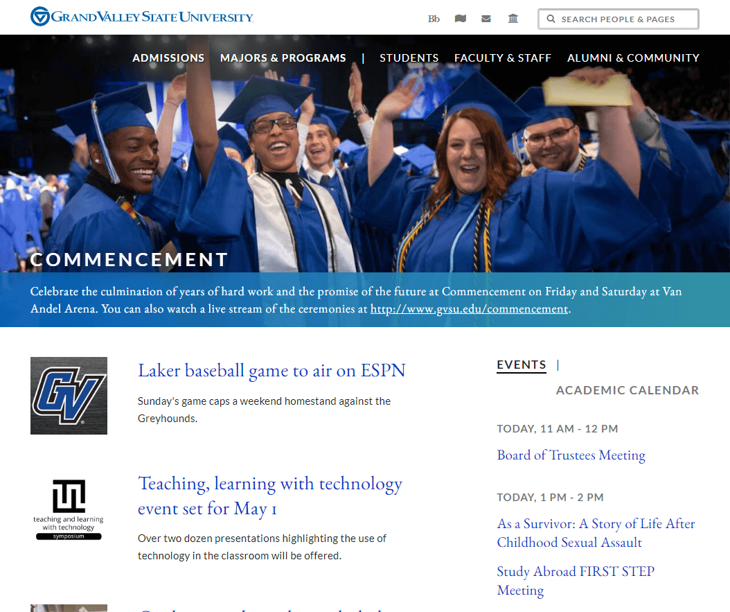
Grand Valley State University
Erik Runyon – University of Notre Dame
I spend next to zero time looking at higher ed websites, other than from a performance perspective. So through that lens my favorite would have to be Grand Valley State University. The team at GVSU have done an excellent job of creating a high-performance website. And as an added bonus, if you enter the Konami Code on their homepage, you can play some retro games.
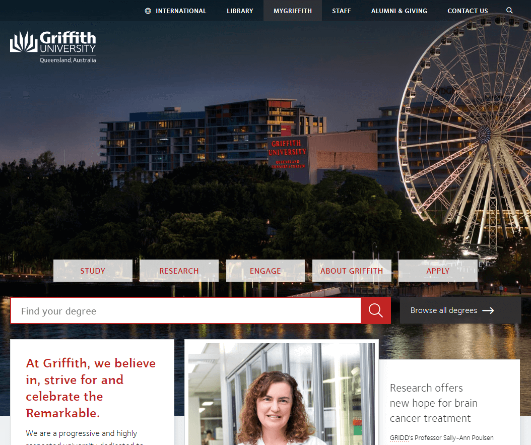
Griffith University
Cade Whitbourn – Charles Sturt University
The public web presence of Griffith University is impressive with the ability to personalize content, and streamline the application process based on courses you have viewed. Their student portal (behind a login) also offers a great student experience, with a good mix of personalized features, relevant messaging, progress indicators, and timely content.
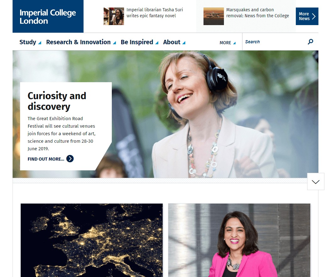
Imperial College London
Conny Liegl – California Polytechnic State University
Imperial College London makes great use of whitespace. The homepage communicates a lot of information, but all content pieces are color-tagged and categorized for easy processing without sensory overload.
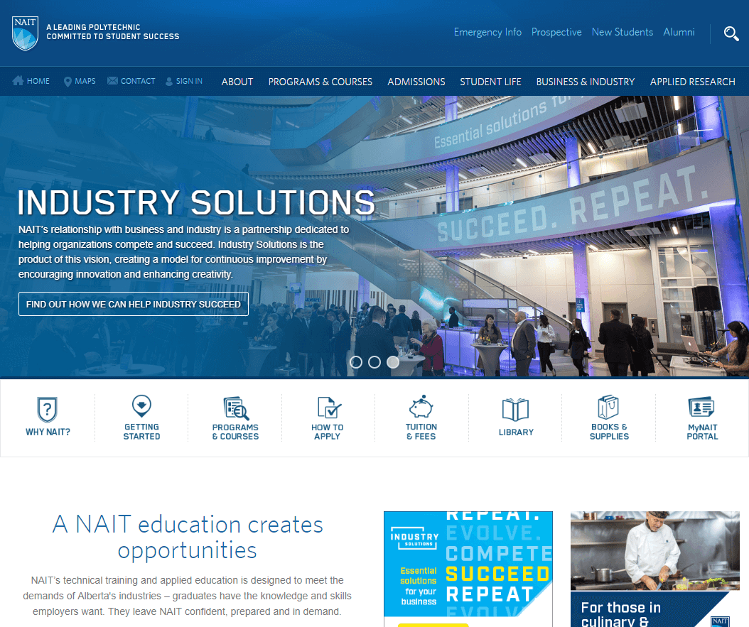
NAIT
Jason Buzzell – University of Nebraska at Omaha
NAIT has a consistent top navigation and consistency of templates across the domain.
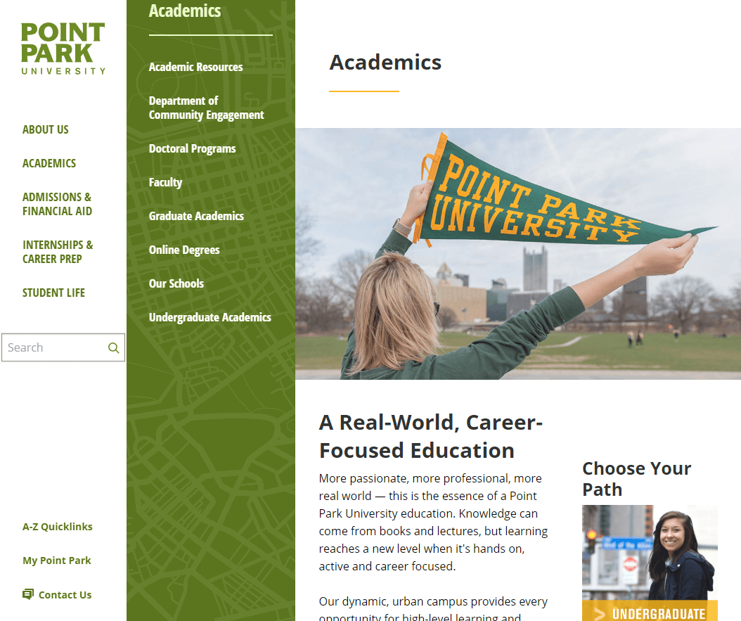
Point Park University
Mike Henderson – Adams State University
A friend pointed Point Park University‘s site out the other night and it has stuck with me. It has a nice color scheme and I like how the navigation tucks into the left side of the window as you navigate the site. The map graphic behind the navigation is a nice touch.
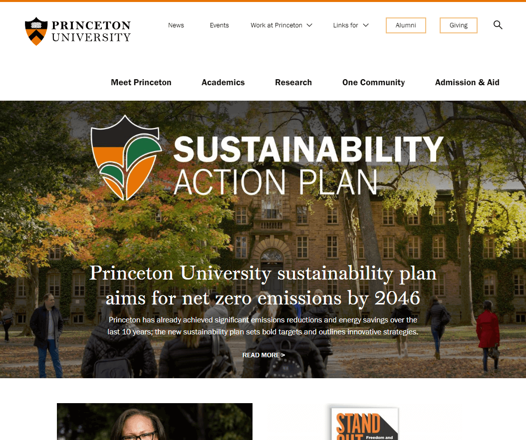
Princeton University
Ryan Dee – University of Nebraska–Lincoln
Princeton University’s site avoids superfluous distractions and focuses on clean, well-designed content with sections that occasionally bring to mind Swiss / International style layouts. One of those sections – the Libraries section on their Academics page– even includes a carousel. *gasp* So many sites get the deservedly-maligned carousel so wrong, but Princeton gets it right. No marketing headlines, no calls to action, just pretty pictures.
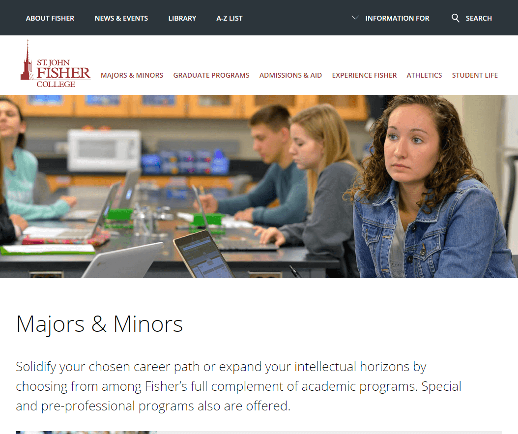
St. John Fisher College
Mike Henderson – Adams State University
I really like how St. John Fisher College has approached their major and minor navigation. As you filter and select a program you are given a glimpse at what the program is about and other information is provided like a contact without having to visit the next page.
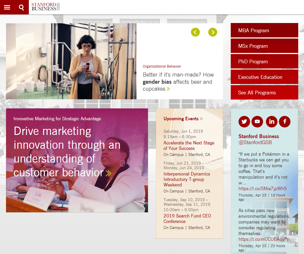
Stanford Graduate School of Business
Joshua Charles – Rutgers Business School
Stanford Graduate School of Business‘ website uses Drupal very effectively to relate different types of content. For example, faculty publications, books, and working papers are tagged by author. The tagging system combined with smart information architecture enables robust search and filtering for end-users, and a degree of automation for content managers. Their system also reduces duplicate faculty content as it’s created once, tagged, and fed into appropriate contexts around the site.
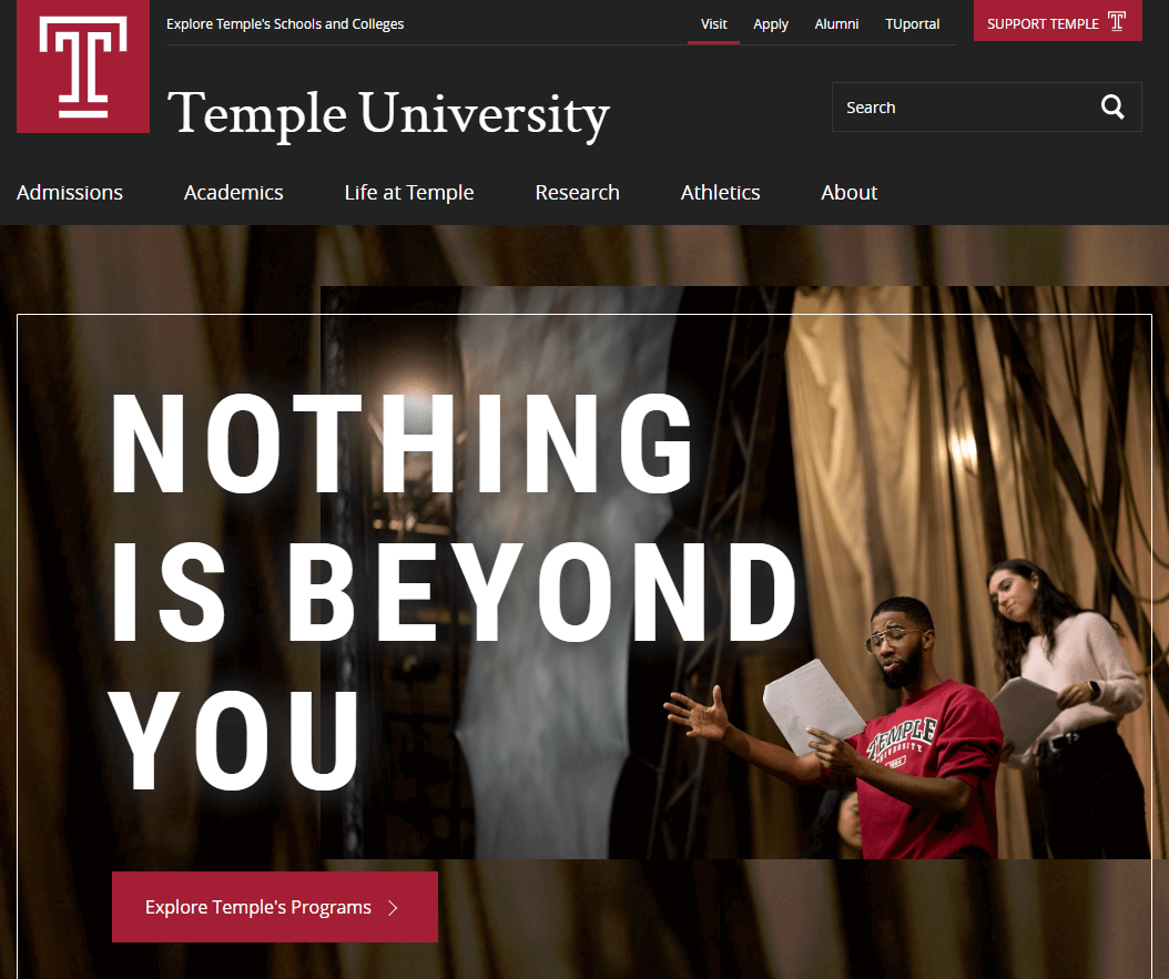
Temple University
Stephanie Geyer – Ruffalo Noel Levitz
Temple University is doing a great job of putting admissions first. Scroll down to see how they categorize their news stories, which I think is appealing to a wide variety of users. Even if you just skim and don’t click you get a sense of what they’re into (sustainability, community engagement, research), which reinforces their brand.
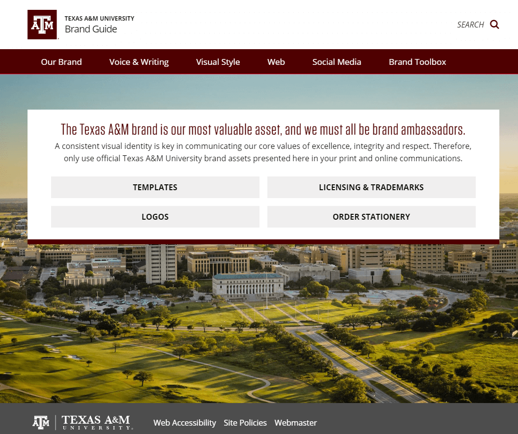
Texas A&M University Brand Guide
Courtnie Ridgway – Tarleton State University
Texas A&M University Brand Guide is the stuff of dreams. It’s user-friendly, easy to navigate and covers everything from tone of voice to a toolbox with templates galore. They have armed their community with the tools and guidelines needed to maintain consistency across both digital and print collateral. I also love that the opening page contains quick links to some of the most popular areas in the guide. It’s a one-stop shop for their marketers across the university.
The Harvard Gazette
Ryan Dee – University of Nebraska–Lincoln
The Harvard Gazette breaks out of the mold of stodgy web design with asymmetrical layouts and quirky but tasteful typography. With touchscreens on so many devices these days, hover effects can often feel tacked on like an afterthought. However, the hover effects on this site are restrained but effective. For example, hovering over an image increases its brightness with a CSS filter. And in the list of Latest and Trending articles, a thumbnail image is displayed on hover, bringing the user’s attention to a single article at a time.
No hover? No problem. All of the content is still present on touchscreens. Progressive enhancement FTW! See also: The Engine (MIT) and News @ Northeastern.

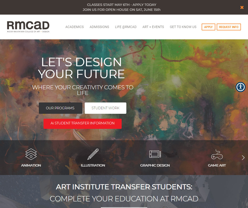
The Rocky Mountain College of Art and Design
Courtnie Ridgway – Tarleton State University
The Rocky Mountain College of Art and Design is a lot to look at, but then again it is an art school. When I first saw this site, several features really jumped out for me. I love how easy it is for a first time user (or even a frequent one) to find exactly what they are looking for using quick links for either areas of concentration or those that have been segmented by audience. Not only do they highlight student work on the homepage, but they have a great section about their alumni, including where they are working. That information is appealing to all audiences, and does a great job of showcasing the value of a RMCAD degree.
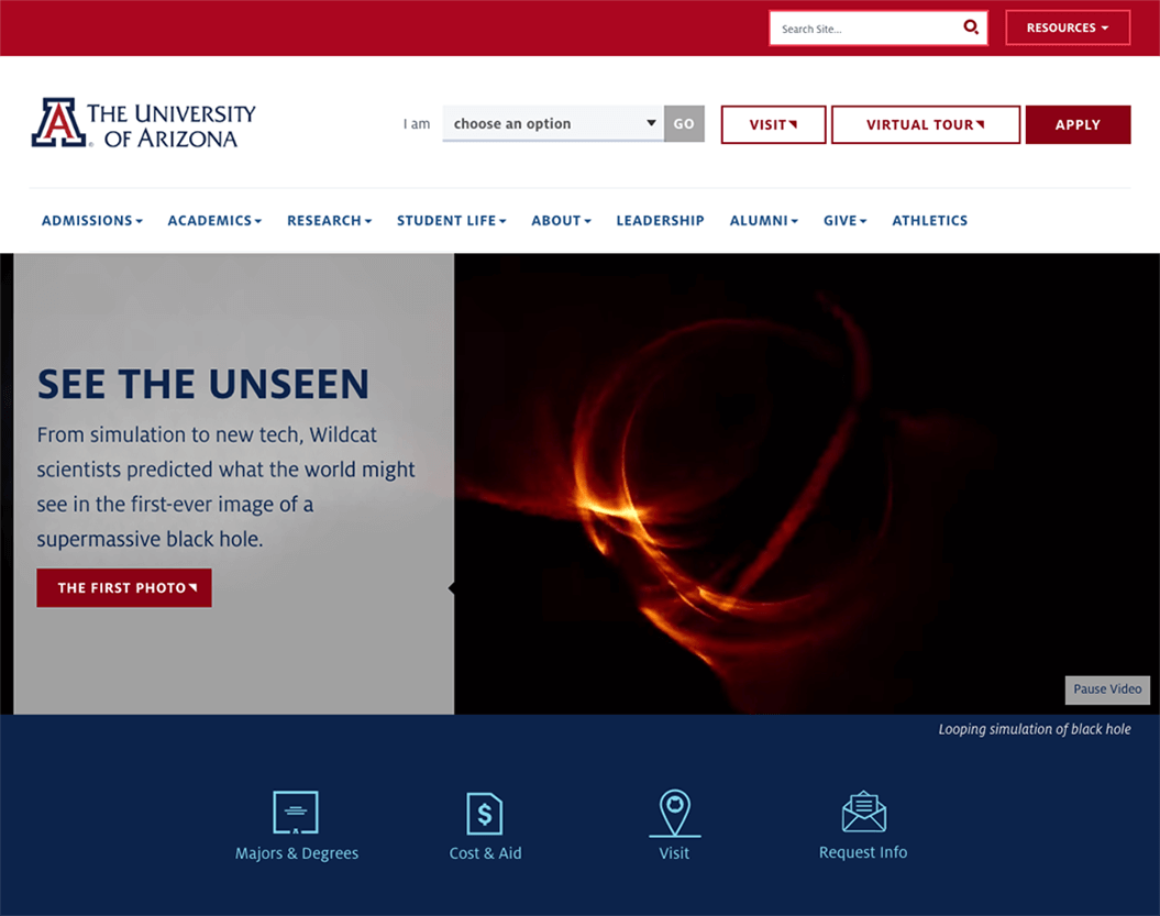
The University of Arizona, Tucson
Kimberly Charles – University of Illinois at Chicago
The site of the University of Arizona, Tucson puts call-to-action links for Majors & Degrees, Cost & Aid, Visit and Request Info just beneath their large header image. In addition, they have a content block on the home page titled “Prepare for Tomorrow” which highlights various career services they offer. Making this information a high priority for their prospective students is valuable and demonstrates a commitment to serving their students beyond the classroom and recognizing their long-term needs from their education.
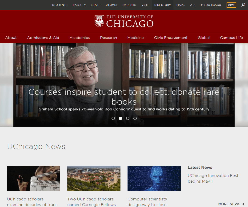
The University of Chicago
Aaron Coleman – University of Nebraska–Lincoln
The University of Chicago is the perfect example of a site that wows without trying anything over-the-top.
Nice, subtle interactions throughout, super sharp and readable with high contrast text everywhere. Of course it passes W3C without a hitch. Their news site is a standout as well.
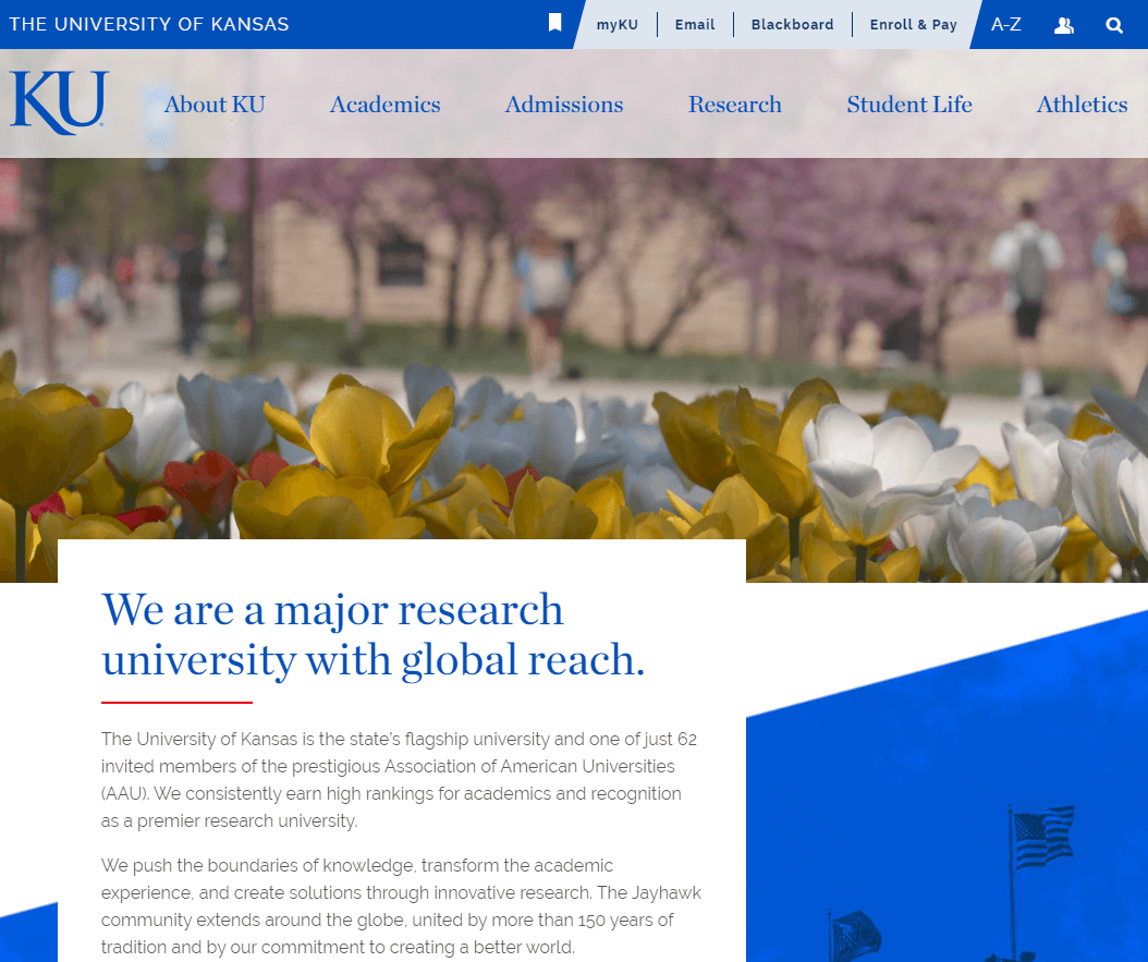
The University of Kansas
Kimberly Charles – University of Illinois at Chicago
The University of Kansas was one of the first public research universities to tackle the challenge of bringing their many school and department websites into a consistent design and navigation scheme. They were an inspiration as we tried to wrangle the wild west of our sites. Their initiative was supported from the top down and they clearly communicated their plan to the entire campus community. It helped us to create a model for our efforts to bring consistency across our sites.
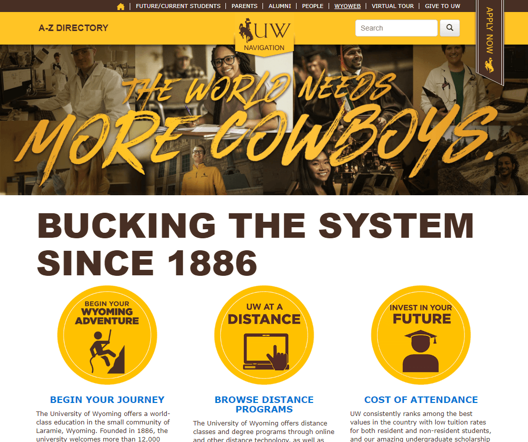
The University of Wyoming
Stephanie Geyer – Ruffalo Noel Levitz
The University of Wyomingis a great example of strong brand positioning, consistent messaging and a website that tells the story of the school, students, programs and culture while driving prospective users through the enrollment process.
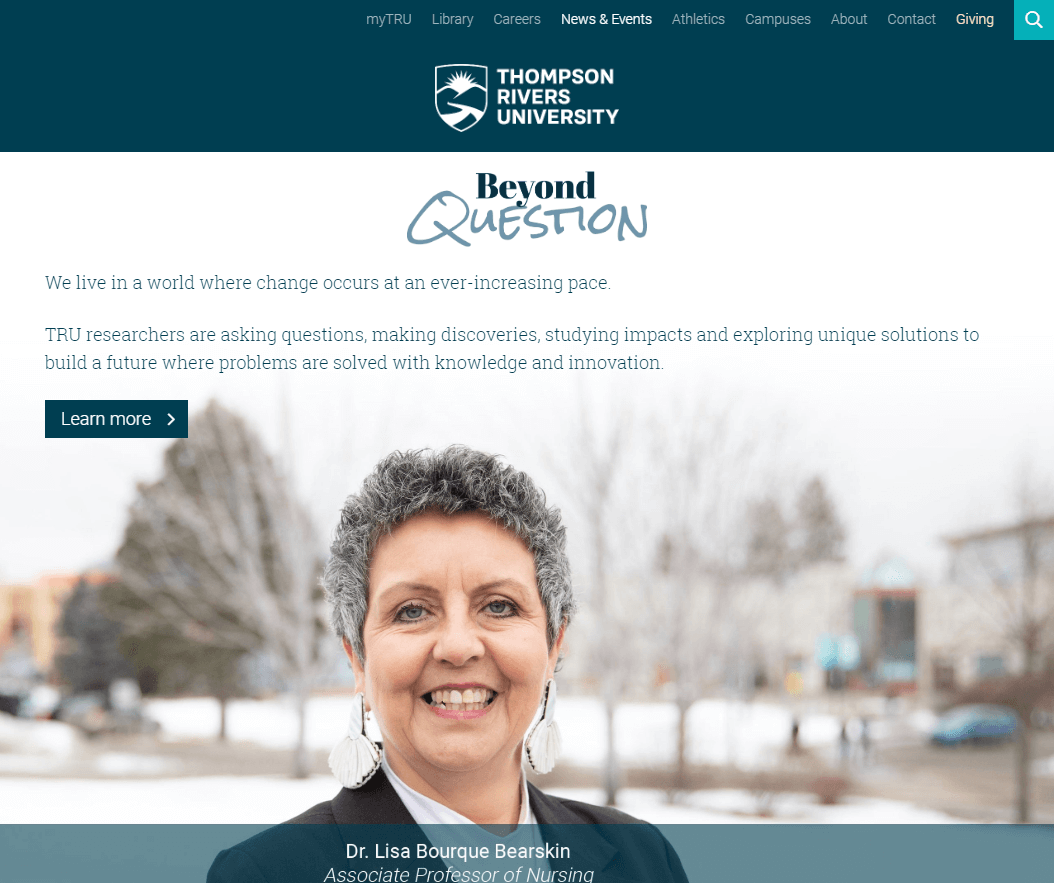
Thompson Rivers University
Jason Buzzell – University of Nebraska at Omaha
Thompson Rivers University has a consistent top navigation and consistency of templates across the domain.
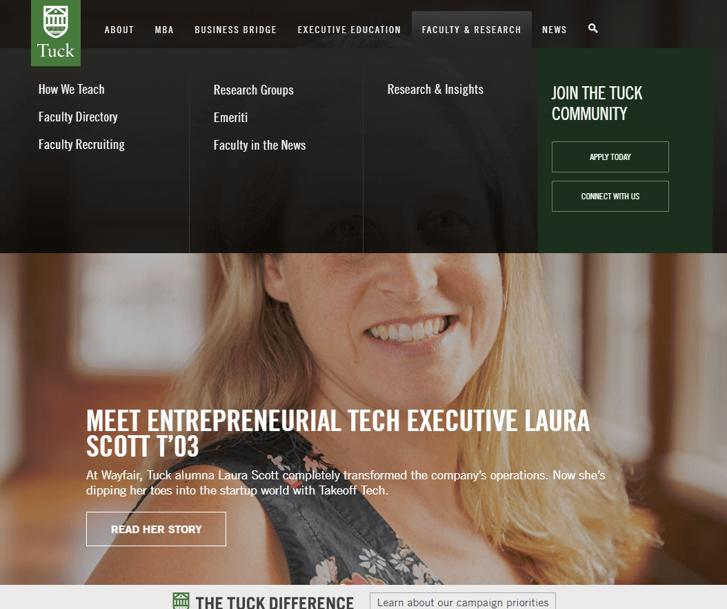
Tuck School of Business
Joshua Charles – Rutgers Business School
What stands out to me on Tuck School of Business‘ website is the well-designed sitemap for their main site and their strategic use of subdomains for other internal and external functions. I think there are technical and web governance advantages to having sites that do one or two things really well, and spinning off auxiliary functions into separate sites, rather than having one or a handful of mega sites that try to be everything to everyone. Tuck does a great job simplifying and managing its portfolio of web needs.
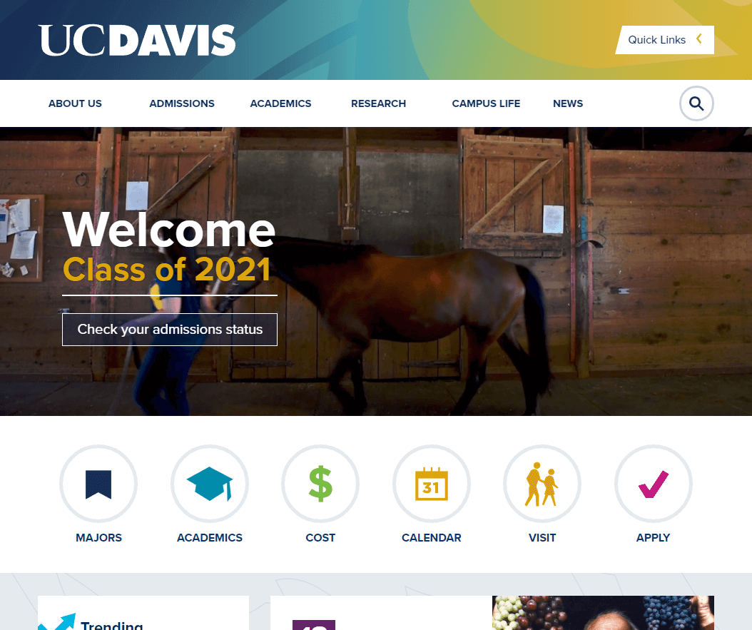
UC Davis
Kimberly Charles – University of Illinois at Chicago
I often look at the top schools in the University of California system since they consistently have multiple schools among the top 20 public universities. One design element that stood out for me on UC Davis website is the strip of icons below the homepage “Explore our Campus” video. These call-to-action links encompass the top questions that prospective students have in their first investigations of schools that would be a good fit for them: Majors, Academics, Cost, Calendar, Visit, Apply. It is valuable to have those links appear high on the page with simple, user-friendly language. And on mobile they look even better since they are immediately visible. The Majors page is simple, searchable and references a blog “What Can I do with My Major?” This is great information to make accessible to prospective students.
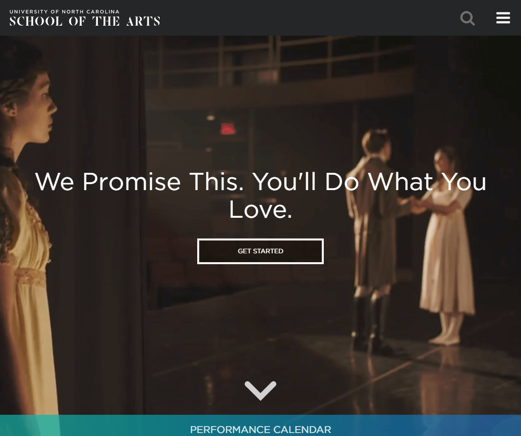
University of North Carolina School of the Arts
Elizabeth Gray – Purdue University
University of North Carolina School of the Arts is absolutely gorgeous. It not only has beautiful photography, it keeps things interesting by showing a new selection of imagery on each refresh. The text choices and colors are bold and clear without distracting from the content.
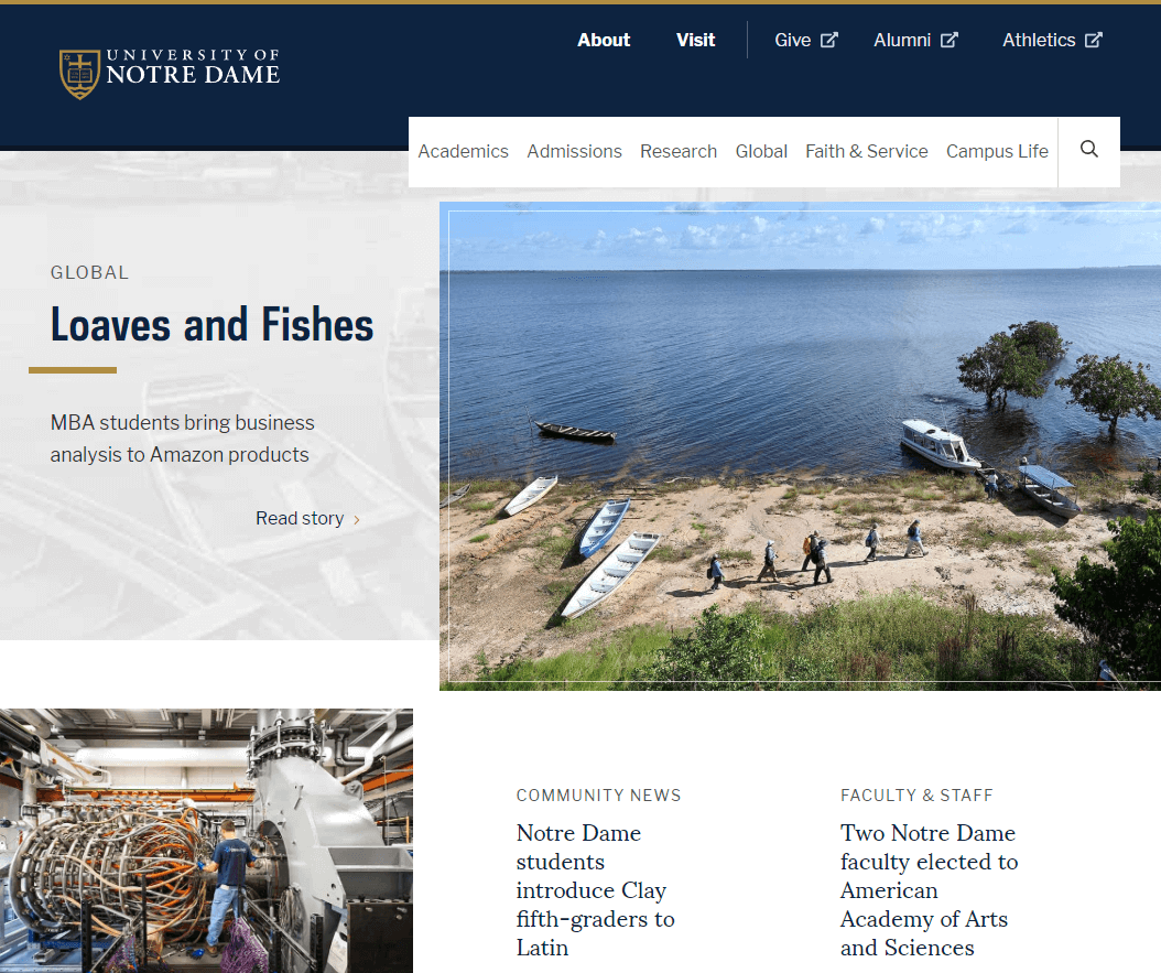
University of Notre Dame
Conny Liegl – California Polytechnic State University
The University of Notre Dame is truly built for mobile devices. The homepage translates beautifully on a desktop but shows its real strengths on mobile. It’s clean, simple, straight-forward and easy to navigate.
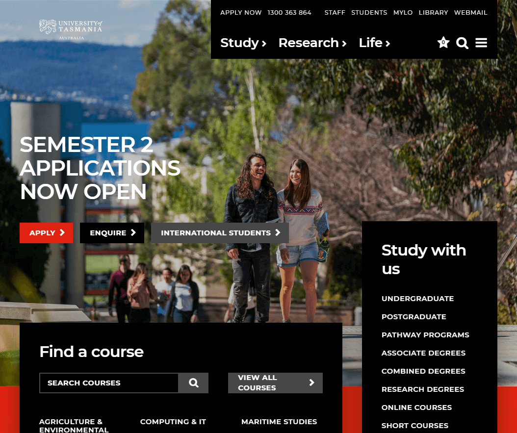
University of Tasmania
Cade Whitbourn – Charles Sturt University
I think the University of Tasmania is doing a lot of things right, with a clear bold design, a deceptively simple IA and rich browsing features.
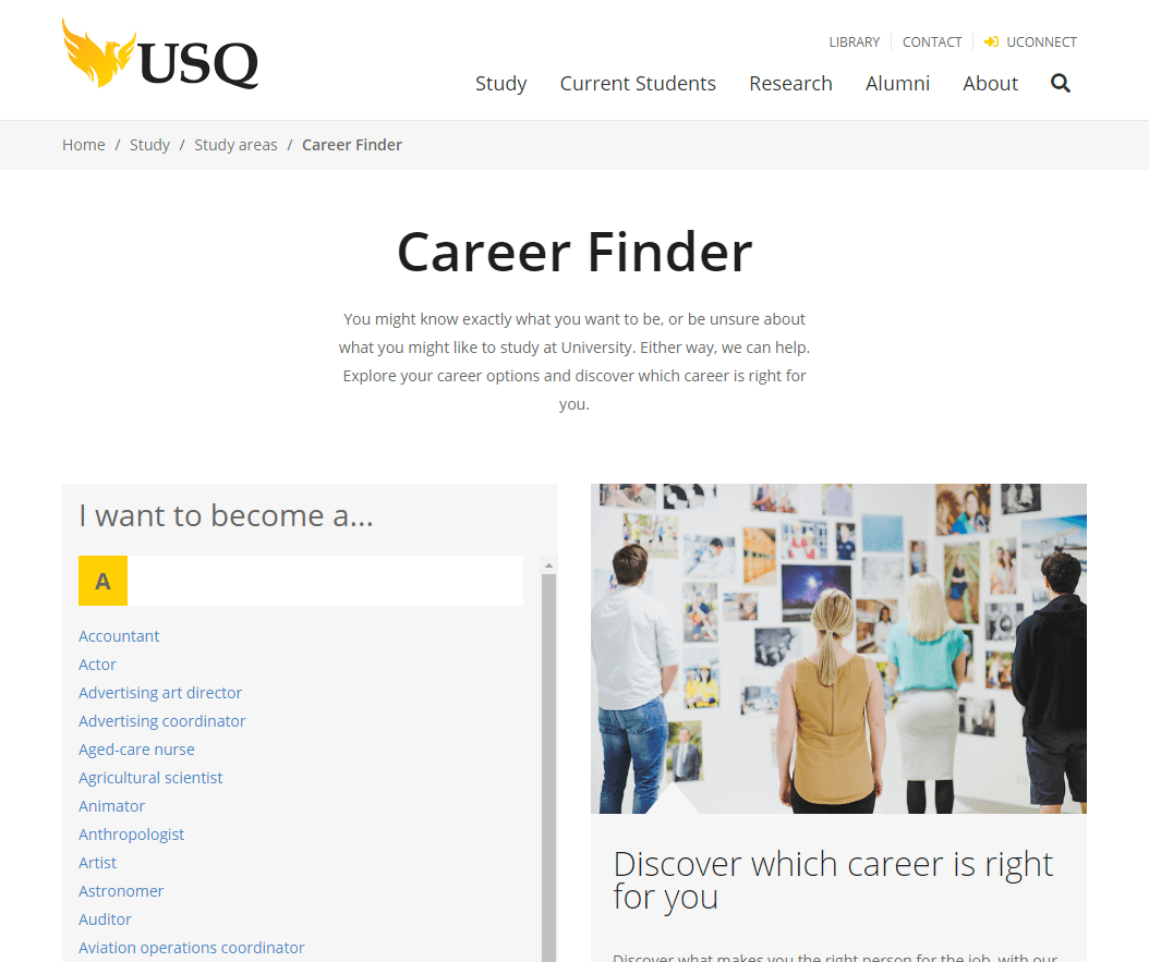
USQ
Cade Whitbourn – Charles Sturt University
I like how USQ allows you to browse by careers, and then offers appropriate corresponding courses. This really is taking a user focus. They also offer a customized “career explorer” tool.QUT also has very effective personalisation features.
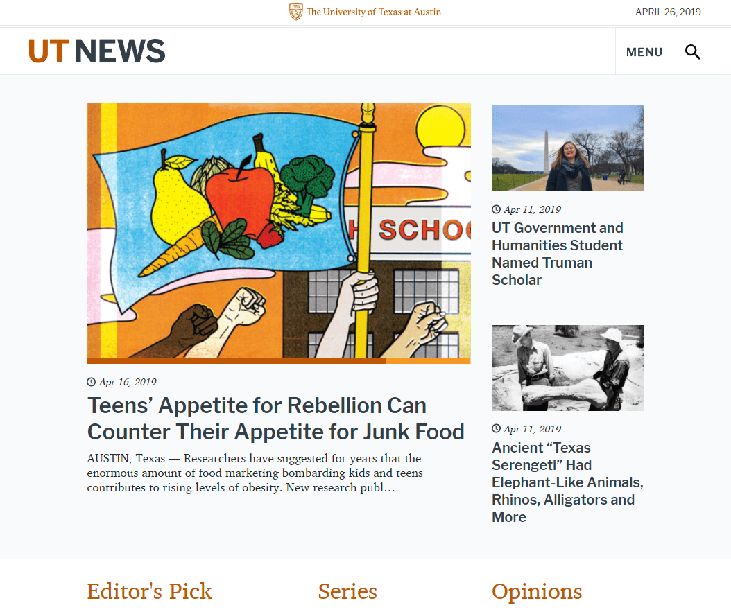
UT News
Aaron Coleman – University of Nebraska–Lincoln
UT News is a super clean publication site with great use of whitespace that really makes the imagery pop. Understated but effective typography, minimal design and easy to read.
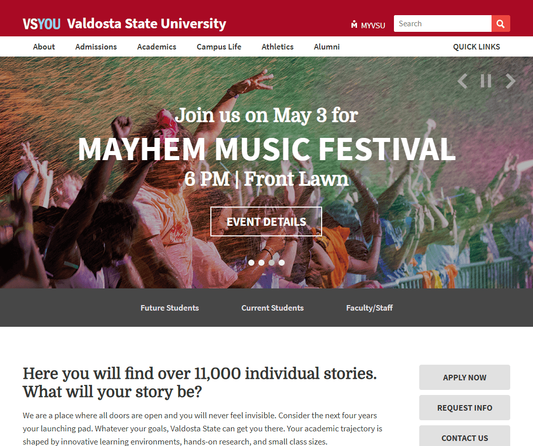
Valdosta State University
Mike Henderson – Adams State University
Valdosta State University has been on my inspiration list for a while. This site is really clean, nice typography, and I’m a fan of their school colors. I like how they incorporate screened images across the site in red and grey to give the visitor a feel for the campus.
A conference focusing on higher ed WEBSITES?
The Higher Ed WEBSITES Conference is a must for higher ed web professionals and teams looking for inspiration, ideas and best practices.
Read below what a few of your higher ed colleagues who attended of the Higher Ed WEBSITES Conference said about the experience.
Tags: hew19, Higher Ed News, Karine Joly