 Dan Herrero, Web Development Specialist at Lehigh University, is one of the 12 presenters of the 2018 Higher Ed WEBSITES Conference.
In this 4-question interview, Dan tells us about the best website advice ever, the most challenging part of the job of a higher ed web pro, a great web tool and shares a top 3 of favorite higher ed websites.
1) What is the best advice you’ve ever been given about higher ed websites?
It’s applicable to many, many things, but “there is more than one way to do it” (or any variation of that saying) is advice that I always have in the back of my mind.
In this field, it can be easy to get bogged down with trying to find the perfect solution to a problem.
There could be any number of equally “perfect solutions” to any given problem. For me, it really comes down to implementing solutions that help achieve our university and/or team goals, and focusing on creating experiences that keep our visitors engaged and enable them to find the information they are looking for.

2) How do you cope with the most challenging part of your job?
One of the most challenging parts of my job is keeping up with the ever-changing landscape of the web. One thing that I do to cope with that is to continually set aside time in my schedule to seek out new trends, tips, and techniques both in higher ed and general web development.
This could be through blogs, email newsletters, attending webinars and conferences or learning from my colleagues. I also try to find opportunities, no matter how small, in every project that I work on to experiment with something new that I’ve learned along the way. This helps me not only to continually expand my web development knowledge but also to increasingly refine our website.
3) What is your favorite tool?
One of my favorite and frequently used tools is Google Lighthouse.
It’s a great tool for instantly auditing your web pages in terms of performance, accessibility, SEO and more. It’s available as part of Chrome’s DevTools (and also as a Chrome extension), and since I’m already using DevTools quite a bit when I’m working on a project, it’s very handy to be able to run all of these audits in the same place and get actionable advice on how to make improvements.
I like to use this as I’m working on a web project to identify potential issues along the way, rather than trying to scan for and fix them all at the end of a project.
4) What are your top 3 favorite higher ed websites?
I’ve always enjoyed taking a look at the websites of other schools to see what they are doing differently and how they are solving the problems that we all have in common. As a result, I have a lot of favorite higher ed websites, and it’s really tough to pick three.
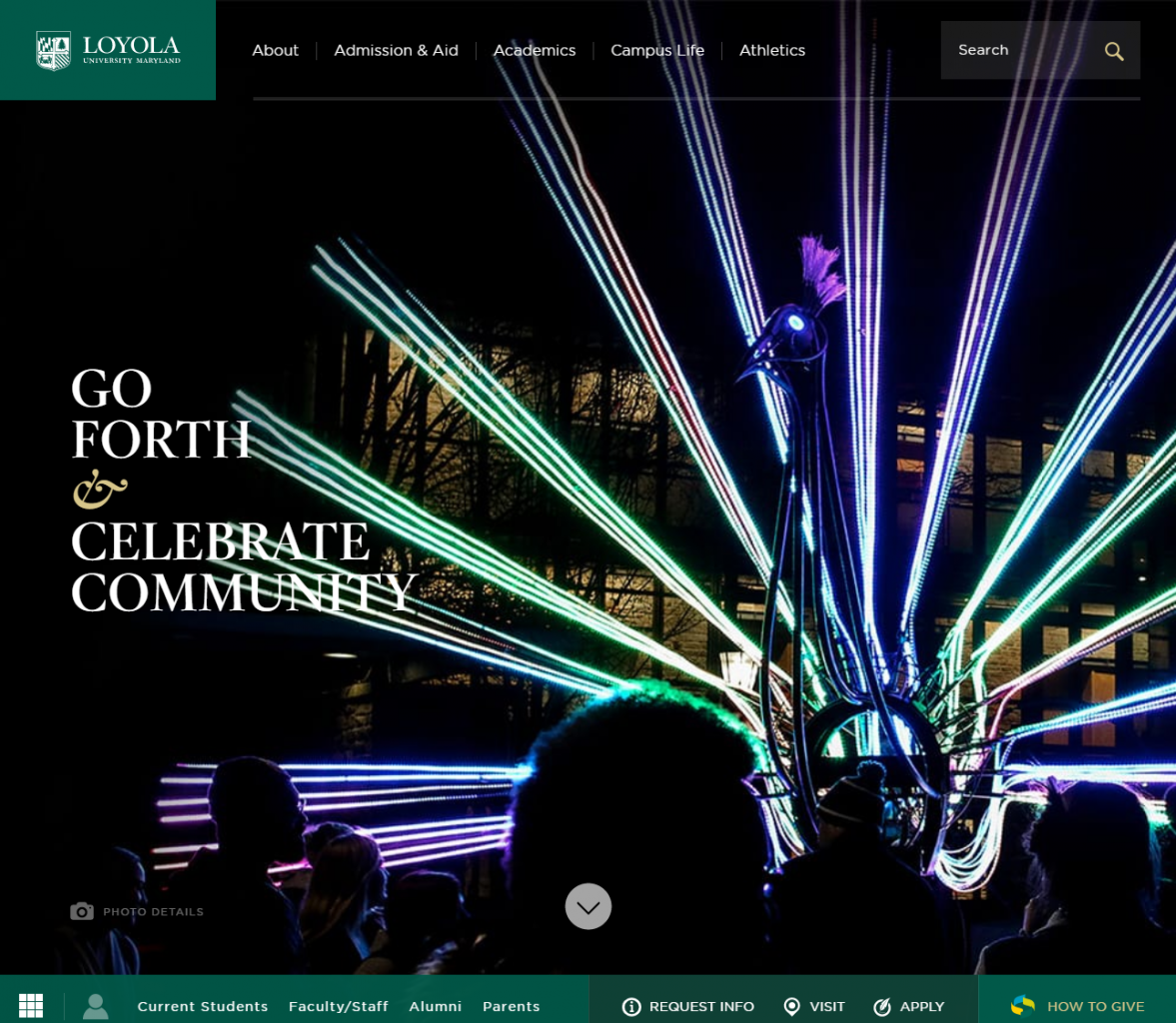
- Loyola University Maryland
One higher ed website I was looking at recently that quickly became a top favorite is Loyola University Maryland’s. I love the experience of scrolling through their homepage. I think having the “trending” links section there is a really interesting device to serve up popular links that are likely relevant to their visitors. I also really like the “Meet Our Community” sidebars that they have throughout their subpages. That’s really great content and I like the way they’ve implemented it. I think their navigation and breadcrumbing is really nicely designed and executed, as well.
- Johns Hopkins University
Another one of my top favorites is Johns Hopkins University. Again, I really like the experience of scrolling through their homepage and its overlapping sections. I can really appreciate how well that translates when viewing the page on a mobile device, which is often a delicate balancing act. I also think the subtle hover and scroll interactions they’ve implemented on their homepage and throughout their site are great and are the kinds of things I love to look for when I’m visiting other higher ed websites. I also really like how easy their interactive program finder is to use.

- Princeton University
Lastly, Princeton University is another favorite of mine. I find their website to be very elegant and easy to navigate. I’ve also found there is a noticeable consistency between how their pages are structured, which helps make a pleasant visiting experience. Their website is also extremely simple to navigate and use on a mobile device, which is easy to take for granted, but still so important to get right.

A conference focusing on higher ed WEBSITES?
The 2018 Higher Ed WEBSITES Conference (now available on-demand!) is a must for higher ed web professionals and teams looking for inspiration, ideas and best practices to kick off their summer projects.
Read below what a few of your higher ed colleagues who attended the 1st edition of the Higher Ed WEBSITES Conference say about the experience.
Tags: HEW18, Higher Ed News