After I published the first Higher Ed Website Redesign Story from Bucknell University, I was told that Colgate University completed 2 redesigns. So, I reached out to Jason Kammerdiener, Web Manager at Colgate University, to ask him to share his higher ed website redesign story with us.

After over two years immersed in the tandem processes of rebuilding the Colgate University website and preparing and creating a website for the celebration of the University’s bicentennial, I was thrilled to be approached by Karine Joly to share a bit about it.
Goals for the Redesign
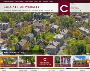
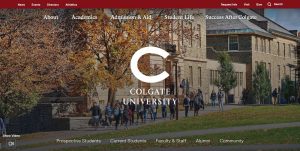
 The primary impetus behind our redesign was straightforward. Our site was last overhauled in 2012. As websites do, it was showing its age visually, content was “Frankensteining” (what happens when multiple contributors manage content with different goals over time), and we had to address some foundational aspects of site-building such as responsiveness and accessibility. With the University also refreshing its visual identity, the need was clear.
We also decided the time was ripe for two big transitions:
- Leave Sitefinity, the CMS we’d used since 2009, for a more mainstream CMS (Drupal). This transition would make future hires easier to find, put us in a larger community of users for collaboration, and enlarge the pool of talented agencies with whom we could partner for this and future projects.
- Move hosting off campus. Our network team has done an amazing job supporting the website, but the benefits of moving to the cloud surpassed the cost of doing so. We decided to make the transition to Acquia. This also frees up network staff time for the million other ways they support a modern campus.
 Finally, we charged ourselves with writing more effective content by more intentionally identifying the primary audience of any given page. We wanted to stop telling prospective students about programs while simultaneously explaining the minutiae of participation to internal audiences. We were looking for a strategy and architecture that would allow us to effectively speak to these audiences with greater focus and clarity.
The Team
I am the web manager in the University’s Communications Office, with a web content specialist and a digital production specialist. We work with a designer within our own office, and partner with two full stack programmer/analysts in ITS. Together we are the University’s “web team.”
We conscripted additional internal assistance for content work, borrowing time from two writers, and editorial support from three staffers and a freelance editor. Even with these many internal hands involved, nearly everyone maintained significant other responsibilities throughout the project. We therefore relied heavily on an agency partner.
After an RFP and a robust partner selection process, we partnered with idfive, an integrated advertising agency in Baltimore, MD. They drove the process, adding a project manager, designer (at times two), an information architect, and a development team. The development team functioned with a primary developer, with two or three additional contributors at various points.
Process and Timeline
Finding the right partner may have been our most important step. We understood that we were seeking not only a partner to build a website, but one who would also fill the role of teacher as we learned a new hosting environment and CMS. Our search yielded 17 proposals, and five on-campus meetings before the selection of idfive. The RFP was seeking a single partner for two distinct projects: the building of a website for the institution’s Bicentennial, and the full website redesign.
The project to refresh of the University’s visual identity in partnership with Pentagram began several weeks prior, so our timeline had to be managed and refreshed to ensure it remained in alignment with the identity work — we couldn’t build a site until there were visual guidelines for doing so.
idfive brought a clear roadmap for discovery and requirements gathering, information architecture, strategy, design, and development, including testing along the way. Even so, it was critical that both parties remained adaptable throughout.
We believed it was vital to right-size the involvement of internal stakeholders. As subject matter experts and significant users, their insights were very important. At the same time, they are not our primary audience of prospective students, nor are they web experts; we did not want them to drive the project alone. To that end, over a three-day period on campus during our discovery phase, we met with a wide array of stakeholders ranging from faculty directors to international students to CMS users.
Ambitiously, when the project advanced to content creation, we developed a schedule for meeting with nearly every campus department and office to specifically evaluate and prepare their content for transition to the new website. Over eight months, a team of four internal writers and four editors engaged offices/departments in two-week, overlapping content sessions. An expansive, well-planned and formatted Google Sheet recorded content status and details such as the redirects that needed to be built for each page.
![]()
Ultimately we didn’t meet with everyone (we’re circling back now), and not every outcome was perfect. However, the effort to meaningfully engage with subject matter experts improved the final product, focused internal energies on aspects of the project with which they could help, and built goodwill.
Key Tips
After going through two redesigns, I’ve learned the following:
- Find the right partner. Take time to write a good, thorough RFP, and stick to your guns about what you require.
- Have a plan, and potentially a platform for fielding bugs and issues when you launch. We used Help Scout to temporarily add a beacon to our website. It was easy for users and it automatically collected details such as page URL and browser version that users often overlook when reporting issues.
- Have thick skin; trust that you’re an expert. We made some unpopular decisions that ultimately were about security, accessibility, and other aspects of the project that the angry folks don’t take into consideration.
- Create a “hopper” for future projects. Great ideas come up but risk creating scope and budget creep. Don’t creep, and don’t lose your good ideas; create a list of projects (I used a Trello board) that can later be endorsed or funded as site enhancements.
Have you recently launched a higher ed redesigned website?
At Higher Ed Experts, we want to try to compile a collection of higher ed web redesign stories, so please reach out to Karine Joly (karine at higheredexperts dot com) if you’d like to write a similar post about your project.
Want to set up a sound measurement process for your higher ed website?
Higher Ed Expert’s 4-week online course on Website Analytics for Higher Ed will guide you through all the steps.
With the help of your expert instructor and your classmates (all working in higher ed), you will set up the measurement process you need to assess the performance of your higher ed website.
Sounds interesting?
Find out what our alums said about this course!